Linkedin Elicits (72 hour design challenge)

Linkedin Elicits (72 hour design challenge)

Linkedin Elicits (72 hour design challenge)

Linkedin Elicits

The Design

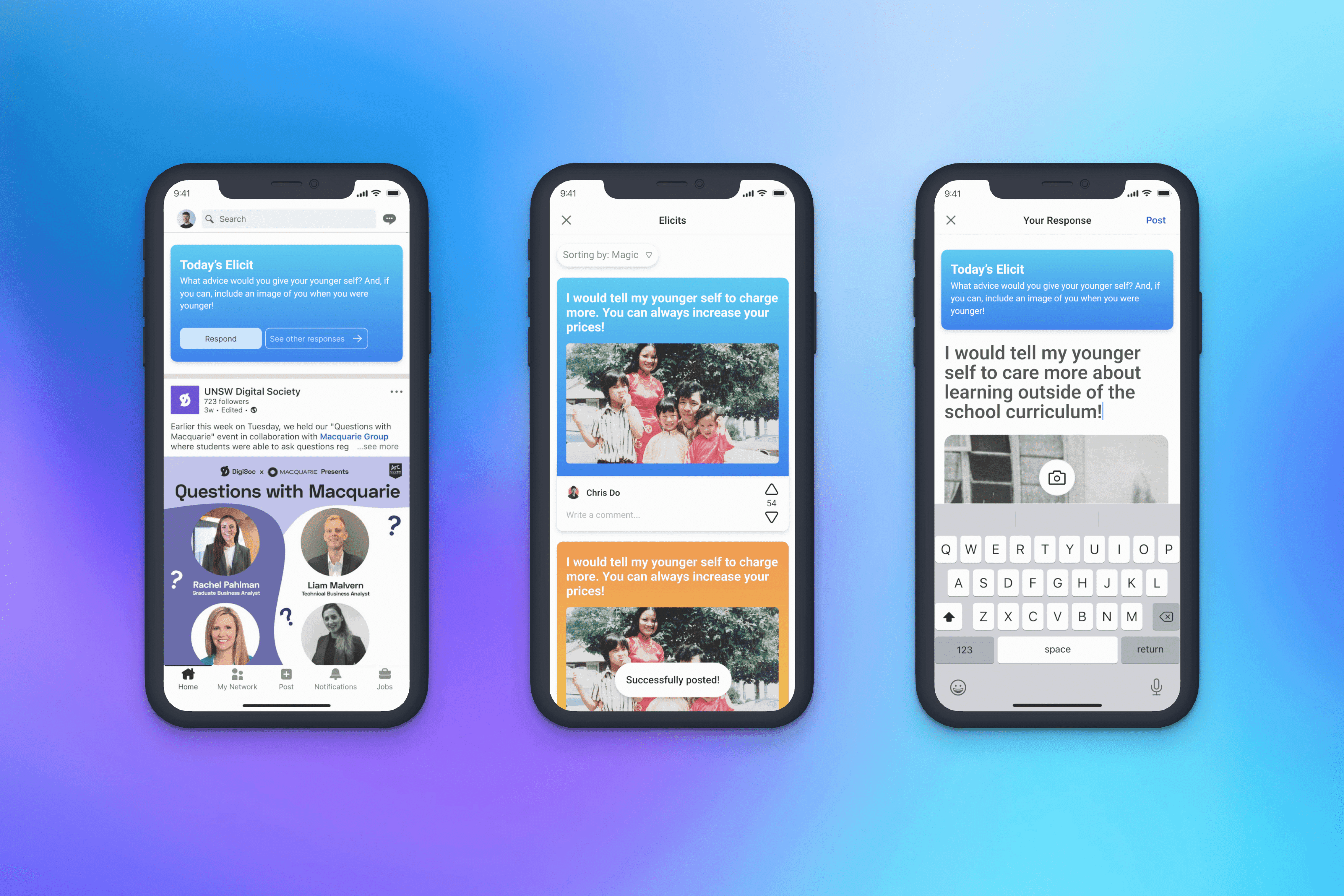
This project was part of the Canva X Prodigi Designathon, during this project we were given 72 hours to choose a social media app and design and experience within the in-app-editor. In implementing a new feature the brief provided hoped that we could potentially boost social interactions and engagement on the platform. Thus leading to our creation of Linkedln Elicits an in app editor that created connections among young professionals.

My contribution

Ui Design
UXR

The team

Zoe UXR
Nick UXR + UI
Ethan UXR + UI + UI prototyping
Process

Wonder

The briefs aim was to create a new feature for a social media product of your groups choice, this lead to us deciding on Linkedln due to it being notoriously known as an outdated and superficial app amongst younger demographics. This lead to us considering 'How might we create an in app editor feature that helps young professionals connect with industry professionals in a meaningful and authentic way, so that they may make advances in their career'.

To ensure the delivery of high-quality of work we started with conducting research through questionnaires, netnographys, User Personas and competitor analysis allowing us to identify established UX patterns that can align with the users' mental models. We then created an affinity diagram to find the users frustrations with Linkledn based off our research we found that on Linkledn


It's very difficult to be found by others

There is no natural connection point

Users are Inundated with bot messages and sponsored posts by spam accounts

It is difficult to begin career building on the platform

Users want to escape the echo chamber of superficial posts

Users want to build deeper and stronger connections

Explore

After the research phase we then started ideating using how might we? as well as Crazy 8s. We then ran through a process of voting and discussed certain ideas that could be merged together to build a robust solution after research and ideation we then decided on working on a feature in Linkeldn that provides daily prompts that are sent to the user and allows them to respond. This would help with key findings as research revealed that creating a connection point for users would pull them away from superficial posts.

Make

We then started to create our new feature that would help improve the users experience with Linkledn with wireframes as well as a user flow to map out the app's functionality and structure. From there, we created a high fidelity mockup and conducted usability testing to refine the design and improve the user experience. The final design then served as an component in Linkledn that improves younger users interactivity with the product.

User Flow Diagram- This then lead to the creation of a user flow diagram that explores decisions and actions towards the feature.

Seeking Feedback and User Testing- We created wireframes to quickly create the usability and structure for user testing so we could quickly iterate. This revealed frustrations of users finding the feature confusing to use, limited options as an annoyance if they didn't want to use the feature which lead to use prioritising improvements for a seamless experience.
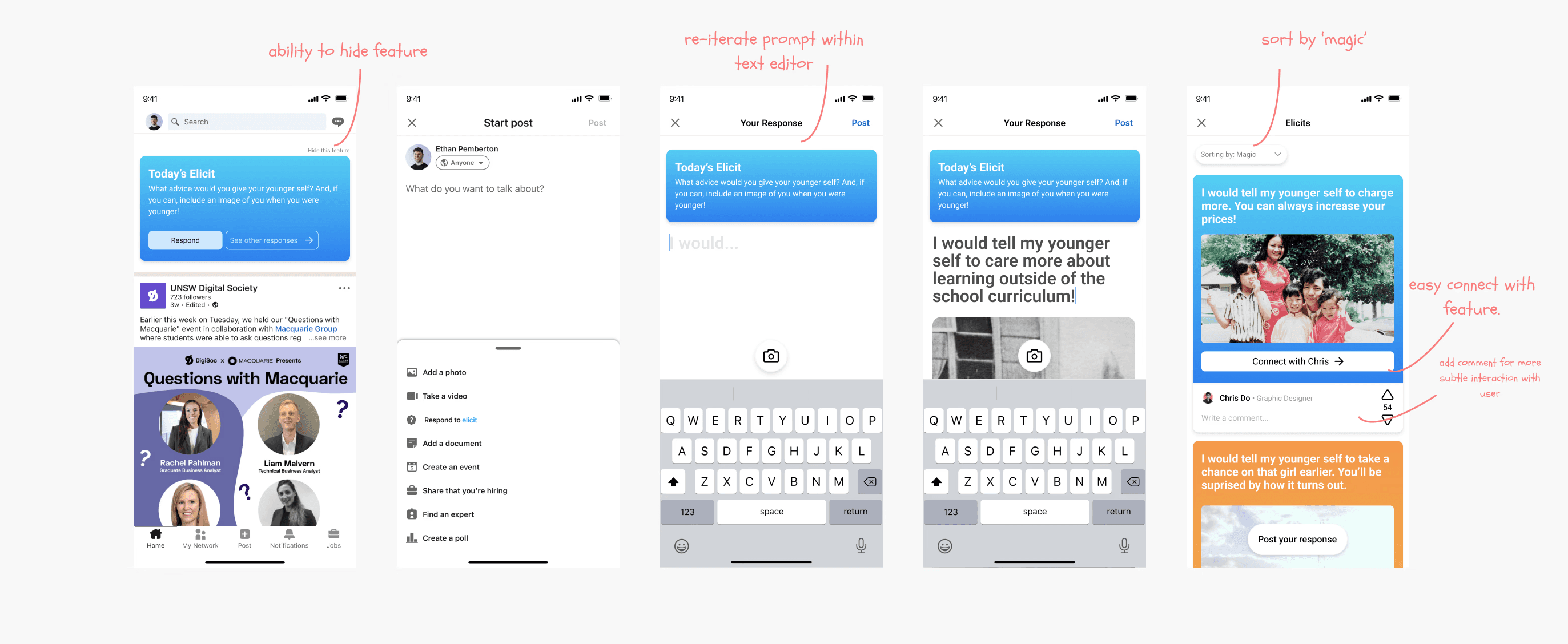
Iterating based on feedback aking on this feedback from the usability testing iterated the problems they had with it. We focused on the difficult time users had figuring out how they can take the connection further through these elicits as this was a fundamental user need from our earlier research.

Prototype Video

The Impact

The Impact

The Impact

The final outcome of the brief lead to our creation of Linkedln Elicits which aims to engage the younger demographic of Linkledn users. This feature aims to encourage users to participate in authentic conversations and allows for more mutual points of connections amongst individuals. Ultimately, this component of the app aims to help entry level younger users to engage with senior professionals.

Key Takeaways

Key Takeaways

Key Takeaways

Given the time constraints, I had to let go of the usual practice of adhering strictly to specific research and design methods. Typically, assignments mandate the use of a certain number of methods, but in this case, I had to focus on what was truly essential and impactful. Moving forward, I’ll always ask myself: "Is this actually helping me understand the user or enhancing the product experience?" If not, I’ll set it aside.

Next project

Digital Art

I’m Alec — a product designer based in Sydney

I’m Alec — a product designer based in Sydney

I’m Alec — a product designer based in Sydney