The Design
The design brief prompted us to explore one of three problem areas which included-
1) Social Inequality
2) Public Health
3) Smart Homes
After selecting social inequality as the problem area we began to come up with a solution to the problem resulting in us to come up with Food Access which is an app that helps the culturally diverse assimilate to the Australian food culture.
My contribution
UXR
User Testing
UI Prototyper
The team
Role-Researcher | UX/UI designer, worked in collaboration with Ben Holeman and Ethan Pemberton
Ben UXR + User Testing + UI Design + Prototyper
Ethan + User Testing + UI Design + Prototyper

Process
Wonder
Explore
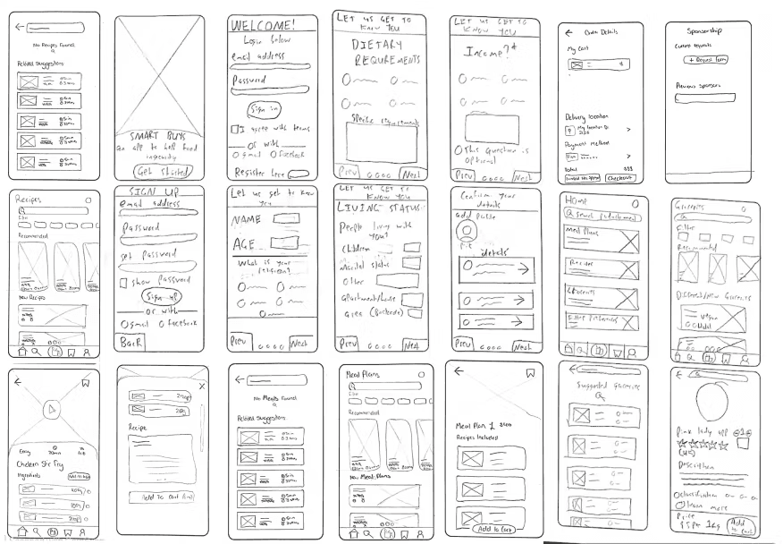
Based on this research, I developed user personas, initial concepts, decision matrix, flow diagrams. This then lead to usability testing (SUS interviews, think aloud protocols structured and unstructured interviews), With our prototypes resulting in iterations ranging from sketches to high fidelity prototypes as well as heuristic evaluations. This ultimately lead to a final mockup prototype as well as a user journey map. Through these methods we came up with Food Access.
Make
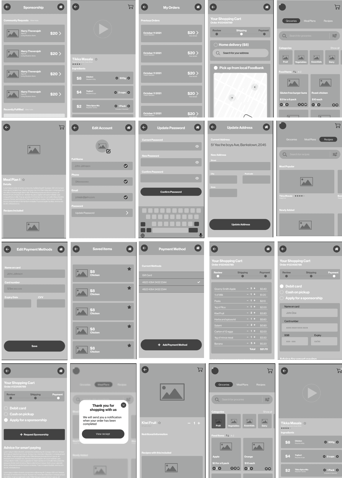
Our process lead to the creation of Food Access a mobile app which helps Culturally and linguistically diverse people, new to Australia food culture this product allows them to easily integrate through a product that's user friendly to any new users whilst being accessible for immigrants through a simple design as well as metaphors that are easy to understand.

Feedback included-Transition to adopt a more instructive and formal tone to cater for different language translations and clarity. Adopt more educational and nutritional product information rather than traditional supermarket reviews Include more prompts showing the ways users are able to interact. Create a way to add only specific grocery items from recipes and meal plans to cart Reviews for products are unnecessary. The bottom navigation bar is quite obtrusive

Need an option to remove from cart, Increase text sizing. Star icon for saving is a bit confusing and not intuitive for CALD users, Ability to quickly order items and have a frequently purchased section. Ability to see how much a meal plan feeds

For the app's aesthetics and minimalist design, we utilised cool colours to signify the various page layouts. The colour selection provides the user with a sense of calmness whilst navigating the pages, this is due to the greens representing health and freshness whilst the blues are calming. Furthermore, for the iconography, we implemented metaphors that were commonly used among other apps making it easy for the user to understand rather than having to read a language they struggle to comprehen
These wireflows document user workflows for mobile and web apps and apps click the image to view out entire process.
We then utilised one of our users personas to explore their behavior and reactions towards the app. This would also allow us to research into future steps.
Food Access Prototype
Outcome
Food Access is an app aimed at helping CALD individuals new to Australian food culture by offering affordable essential foods through bulk buying, saving them from high mark-up costs. It supports users in avoiding food insecurity and includes educational features to promote long-term, independent food purchasing habits. Once users are self-sufficient, they’re encouraged to give back through the app’s donation and support features.
Key Takeways
Overall we were pleased with the final design and we believe that it would help CALD people, with designing an app for a specific target audience we have to make sure the research is accurate and that we're usability testing and designing for the right people in mind so that it's easy for them to use.


